Pages

Monday, December 30, 2013

What the Hall?

So I've noticed lately a desire to get the front of the house looking perfect and then to start working my way in. This means I really wanted to dive in and get the entry and hallway looking their best. And the best way to do that was to get the art up off the floors and on to the walls.


This is what we had been living with for the past few months. Art on the floors, not very exciting.


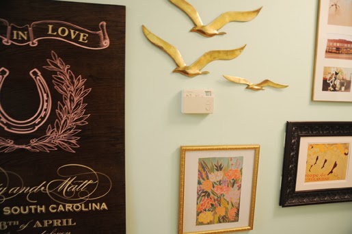
So one night, I came home, took a look around and decided it was time. Out came the hammer and nails. I did do a few mock layouts on the floor before committing to nails in the wall. I also ended up nixing a lot of pieces I thought I was going to use.  The brass birds were definitely a little bit of a challenge and left my wall a little scuffed up. Nothing my left over paint can't fix though.


And they are up!


Close up of my brass birds. Have I mentioned I like brass water fowl? I have these brass birds, a brass duck, and a brass swan. I also have a swan sweater. #putabirdonit


Bare spot #1. I like the mirror and vintage plant print I picked up in Broadway, but I definitely need a few more small pieces to round this out. Decor looks best in odd numbers so the 2 floating  pieces  are throwing me off a little bit.


The main wall from a different angle. Wedding art makes the best art. I feel like half my house is decorated with left over wedding objects, cotton, vases, photos. Ah, happy memories!


Bare space #2. This little side wall just looks kinda awkward to me. I really like the idea of a floating shelf with photo and other nicknacks, so I think I'm going to give that a try next. I would also like to bring a little more color to this space since we are stuck in the mint,white,and gold theme. 


So there you have it. I'll have a follow up post to this one shortly. I fixed some of the bare spots and got a fluffy runner that I can't wait to share!

xo
Betsy 

Monday, December 23, 2013

Table Top

I'm back with another DIY! I bought a duncan pyfe table off craigslist not too long after we moved in. It was $100, how could I say no! Also, it was the perfect size for our large living/dinning combo. The only trouble was it was a little (a lot) dinged up and a little wobbly. Luckily my Dad stepped in and glued the legs back together so it was good and sturdy. But then it was up to me to make it pretty...


This is the surface we started with. Scratches galore.


The full table. Also my handy sander, and my super messy garage. 


Look at those claw feet. Rawr!


And one more of the top of the table. The insert must have not been used as much since the finish was not as worn. The cool thing is that it still pops in and out like a charm. They just don't make furniture like they used too.


So I sanded and sanded and this is what I ended up with. I purchased a product that didn't require me to fully strip the wood. I just needed to sand it down enough to open up the grain so it would accept the new stain. The power sander worked great on the top, but I had to hand sand the legs. 


 Ah, sand dust particles.


I figured I should aslo do a layer of the Sander Deglosser to get rid of any polyurethane and just clean it up some. This stuff is kinda awesome. I used it to "sand" the dresser and nightstand in guest room 1 to much success. Its super easy and quick. Rub it on, wait 10 minuets and your surface is ready to accept a new coat of paint.


The deglosser cleaned up the table nicely and I figured I was ready to go with the stain. I also ran over the table and legs with the shop vac to get rid of any dust particles.


The tools for the job. I choose the Polyshades because like I said, it can go over pre-stained surfaces. It blends uniquely so you end up with a custom shade. I chose the mission oak hoping to end up with a medium tone wood and to help take some of the red out of the old stain. I also followed the directions and treated the wood with the pre-stain.


The pre stain really darkened everything up. It was a lot like oiling a saddle, which I used to be an old pro at, so this step went super easy. 


And layer one! The hardest part was making sure I didn't leave any brush strokes and picking up stray corgi hairs. It definitely turned out a little darker than I first hoped, but I was still happy. And it looked a lot better than what I started with. 


The first coat did leave it a little streaky, but I knew it was going to take a couple of coats to even things out. 


Two more coats layer and a top coat of poly and this is what I ended up with. The table definitely turned into a labor of love. I touched it too soon after the 3rd coat and left a smudge, thus the additional coat of poly. Honestly I could probably even re sand and touch up a few places, but I think its one of those things that I could mess with for the rest of my life and never be 100% happy. MLW was pleased though and made the decision to move it on it. 


And there it is! I'm happy to report I'm liking the chair combination with it, even though the wood tones are different. I'm thinking of adding white end chairs for a mix matched finished look. See this and this for inspiration. I'm super glad I like the 4 chairs we already have though. I was deathly afraid that I would get the table in there and decide we needed 6 new chairs. 6  new chairs = expensive. 


This is the view peeking around our ginormous christmas tree. I sorta knew this before but placing the table in there made me realize that my window is off center, but the light is centered in the window. Thus everything is too far to the right side of the room. Its very tight on that side right now and basically impossible to get in and out of the sliding door. (The GIANT christmas tree isn't helping) That being said, I see swaging a future new light fixture to be centered in the room and not the window. I also have plans to move the white cabinet to the back right side of the wall.


Here is the view from farther back. See what I mean about the window? The table needs to move about 3 feet to the left to feel more balance in the room. Luckily a few little tweaks and a swaged lighting fixture mean we will be in business in this room in no time! Sorry for the nighttime photos. I'll try to do an update in better light so ya'll can see the color better.

Im pretty proud of my little table diy and keep getting more and more confident with doing things myself around the house. It is definitely helping us save money and its kinda super fun. 

Happy Holidays!
Betsy 


Wednesday, December 18, 2013

A few Christmas Trees

For the past few years I have decorated two Christmas trees. One with MLW and one with my mom. Its super fun and makes me feel extra festive. Its also fun to experience two different family Christmas tree traditions. Also for the first time, MLW and I have added exterior decorations. Lights baby!


  Oh, boxwood garland, you make my heart flutter. So pretty, so festive, so wonderful. And $25 for 25 feet. I'll take it! the wreath is just leftover garland looped around a few times. I am having a full on love affair with garland and really want to learn how to make it on my own. So many pretty things to be decorated with it.


Front porch reality check. Hello, my name is Betsy, and I kill plants. Its a personal problem. In my defense, they were all spring plants that made it a good solid 6 months before bitting the dust. I need to make a new plant run to fill my tub. I'm thinking poppies and rosemary. 
Also I can't bring myself to toss the grey and pinky-orange pumpkin. They are both still rock solid and show now signs of rotting. Thus they are staying on the porch. 


MLW is fully responsible for adding the lights and I must say he did an amazing job! We are only one of two people with any outside decorations on our street and are quite proud of ourselves. {Update our neighbors to the right, have gone full out and put us to shame. They are an older couple so we are chalking it up to experiance. MLW and I will get there one day!}


He even ran them along the front bushes. However, this has made me want to be able to park our cars in the garage real bad. You really can't see the porch from the street and that makes me sad. One day I'll clean out the garage and get some door openers so the front of the house can shine un-car interrupted. 


And one more. MLW is a talented husband. : D 


 And on to my Mom's tree. Isn't it cute! Just a little dinker 5 footer. I'm in love. I have secret crushes on all things short and fat (reason 1-1000 why I own corgis).  Mom/Libba wanted her on the table and I had my doubts, but in the end it worked out perfect!


Mom/Libba and I also have a tradition of finding the smallest most ridiculous angel ornament and placing her on top of the tree. Last year she had a 10' tree with the little one on top and it was hilarious! This year she looked pretty funny way up on the top branch. Alas Libba ended up snipping that top branch and placing the normal sized angel up there. But, not before I could snap some photos of this little one's debut.  Dream big little angel, dream big! 


Back over at the House of Watts, I added a little festivity to the entryway. We got  the little wooden tree  on a trip to Savannah from the Shop SCAD shop. Not much, but it takes time to collect Christmas decor.


I really dig it.


And finally our tree! MLW's Mom started an awesome tradition of giving him and his sister an ornament each year. When we got married, MLW got the box of ornaments to hang on our tree and we have been adding to them each year. It is definitely a tradition that I want to continue and pass along to our kiddos. Its really fun to hear MLW's story behind each one. Warms my heart. 

Do any of ya'll have funny/sweet/wonderful family traditions? 

Happy Holidays!
Betsy 


Thursday, December 12, 2013

Sweet Dreams

So we finished off a couple more details in the master bedroom. Just little things to make it feel more complete. I think I told you how I wanted to recover the headboard with the khaki bamboo fabric that I had just draped over the headboard. We also desperately needed a bedskirt. And to top it all off, a basket for seasonal bedding storage.
Here goes: 


This is now what we see looking down the hallway, no more under the bed. Its amazing how a bed skirt can make the bed look complete. I found this one at Bed Bath and Beyond and was initially afraid it would be too yellow, but it turned out perfect. It is also nice and clean so doesn't pull focus or add any bulk.


I need a hand steamer something bad to get all those little wrinkles out. I was hoping it would hang out and they would naturally fall, but its been about a week and no luck. Santa, a steamer please?


Check out that headboard! You couldn't really see the shape before since we just had it casually draped over.

A word of caution. This geometric patterned fabric was wayyy harder to make even and straight than the previous pattern that was just an all over repeat. MLW and I spent about an hour hemming and hawing over whether or not it was straight and guess what? Its still kinda wonky. But only just barely, and not so much that I called for a re-do. 


Oh yeah, and see that basket peeking out in the right side?


Its our new bedding storage basket. Its got our summer blanket in there now. It also serves as a great place to place the decorative pillows in when we are sleeping or MLW "forgets" to make the bed. (which is a lot. Also sorry for fuzzy picture, I blame it on the goat) 


The basket was a world market find. They have HUGE baskets at not terrible prices. It started out in the all natural color, but I was afraid with the jute rug, the basket would just be to much "natural looking stuff."  So I tapped off the top half and used my trusty can o spray paint and went to town. I'm super happy with the way it turned out. The line is not even all the way around, but I think it gives it a nice organic feeling while providing nice contrast between basket and rug.


See how big it is? Plenty of storage for bedding and pillows.


 I thought I would also give ya'll a view of the other side of the bed. I picked this nightstand off the side of the road when we were at our rental and I had more red/orange accents.  I stripped it and painted it a few years ago and its kinda sad to think of redoing it, but I'm just not feeling that color pallet anymore. I haven't come up with anything better yet, but its about the perfect size for that side of the bed so its sticking around for now.


Another view of the wrong color nightstand. It does pick up on the orange in the square pillows nicely, but I'm just not feeling how it contrast against my Palladium Blue walls. sigh. 


Lastly, a closeup of all the patters and textures on the bed. The matelasse bedding is from Pottery Barn, but I bought it on Ebay when I moved into my sophomore college apartment. Its held up really well and takes a pretty good beating from the corgis, but always washes nice and clean. The square patterned pillows are also a Pottery Barn find. The teal velvet pillows are from Pier 1 and an incredible price if you are in the market for velvet. And lastly the little square ikat pillow was from Marshall's. I had it monogramed and am just pleased as punch. 

"The first thing I do in the morning is make my bed and while I am making my bed I am making up my mind as to what kind of day I am going to have" {Robert Frost}

Love,
Betsy

Monday, December 2, 2013

Kitchen dreams

I think my brother summed up the state of our kitchen best. He walked in, looked around and told me I needed to apply for kitchen crashers. That sounded about right to me. Its a HUGE kitchen but missing a few key things to make it function better. And its ugly. I don't like ugly. So here are some pictures of its current state followed by a list of my dreams and a few plans to help get us there.


Problem 1: The countertops are green and held together by masking tape.


Problem 2: the lower cabinets are flat and dated looking. Also super dirty and grimy feeling. 


Problem 3: This is the only prep space right by the stove. We have a ton of counter space but its far away from where we actually cook. 


Problem 4: What is this space? There are cabinets above it so I don't think its supposed to be an eat in. Also its kinda weird to cook with the stove dropping off on that side. Also we have no pantry. Everything is tucked in lower cabinets. And yes its lazy, but a total pain and harder to inventory what food we do and don't have. 


Problem 5: See above and below photo. Florescent lighting. bleh. 


But here's what I like. We have a ton of space. And those glass upper cabinets are beautiful! I'm also madly in love with our new chalkboard wall that we added a few weeks ago. 


I also love the porcelain sink and huge window it looks out over. This kitchen could be amazing! And hopefully one day it will be. We are going to take small baby steps to get us there, but oh do I have plans! 

Heres the List:
-Paint chalk board wall on back wall
-Add shaker style detailing to flat bottom cabinets (see this tutorial)
-Add pantry and lower cabinets to random side of stove (MLW's granddad is super handy, plan below)
-Paint uppers "Decorator's White" by BM
-Paint lowers a blue/grey slate
-Replace all hardware with ballin' brass hardware (that I already purchased when it went on sale)
-New Countertops
-Subway tile backsplash with grey grout (dark grout=less dirty looking)
-Get a new dishwasher to match stove and fridge 
-Actually install hood above stove 
-Replace lighting 
-Style all those pretty glass uppers
-Cook something yummy when its all done 

Lawd. Its a list. But hopefully with hard work, penny pinching and lots of painting we can get it done. Below I've got a couple of ideas we have started throwing around. 


So here we have a swatch of Silestone's Quartz in Lagoon. This is our dream countertop, it looks like marble, and shockingly also costs more than marble. Crazy right? I'm looking at getting a "faurble" that costs more than the real stuff! But marble is super soft, scratches and stains easy. Quartz is crazy strong, stain resistant and can basically take a beating and still look band new.  Our budget might nix this in the end but while we are still dreaming it can't hurt right? I'm open to basically any countertop as long as it has some blue/grey veining in it. 
The brass pulls are pretty sweet right? I've got smaller round knobs for all the doors. The pulls are just going on the drawers. I would also love to switch out the hinges to hidden hinges, but all signs point to them being crazy expensive and we have A LOT of doors to do.  So I think I will just switch out the current hinges to match the new hardware when we get to that step. And yes, I know brass is super taste specific, but I'm going to keep all the old stuff so if we go to resale we can put that back on for a more neutral look. But we aren't selling this house for a long long time so I'm going to live with what I love! 
This drawer has some BM "Nocturnal Grey" slapped on it and I think its a winner. MLW is leaning more towards the bottom photo which is BM "Vermont Slate." If you scroll back up you'll see we auditioned a third color "Newbury Blue" but we both decided it was way too navy. 


Here is MLW's Granddad's amazing rendering of what our pantry and beside stove area is potentially going to look like. Its crazy right! I'm so happy and honored he is willing to do this for us. Granddad's are the best.  :D


And finally here is my inspiration for the kitchen. The lower right photo was another Pinterest find. I love the white upper and darker lower combination. I also am really intrigued by mixing metals in the kitchen ie: Stainless fixtures with brass hardware and lighting. Its a huge fashion trend and I'm of the school that good design is good design whether its clothing, print, bridal, styling, or home.  

So wish us luck and dream big my blogy friends. I'll try to keep you updated as things progress. : D